

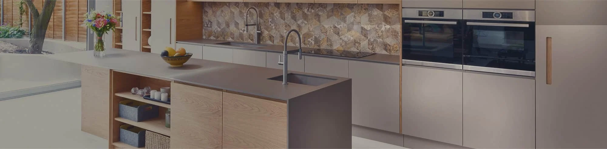
The safest way to match a quartz kitchen countertop with cabinet colours is to compare undertones, contrast and pattern—not just colour names. Warm cabinets usually need warm or balanced quartz, while cool cabinets work better with crisp whites, cool greys or restrained concrete looks. Always compare physical samples together in your kitchen lighting before making the final choice.
Why cabinet and quartz combinations can look wrong
Two finishes can both be described as “white” and still clash. One may have a creamy or yellow undertone while the other looks blue or grey. The difference often becomes more obvious after the countertop covers a large horizontal area. Daylight, warm evening bulbs, flooring and backsplash colours can also change how both surfaces appear.
The goal is not always an exact match. In fact, trying to match two whites precisely can make a small undertone difference look accidental. A controlled contrast or a quartz pattern that includes both tones is often easier to coordinate. This is why homeowners should select cabinets and countertops as one palette rather than making each decision separately.
Quick cabinet and quartz pairing guide
| Cabinet finish | Quartz direction | What to check |
|---|---|---|
| White | Soft white with light grey veining or a deliberate contrasting tone | Avoid two almost-matching whites with conflicting undertones |
| Warm white | Creamy white, warm-veined white or pale greige | Test the pairing under warm and natural light |
| Light grey | Neutral white, soft grey veining or a balanced concrete look | Compare the quartz against flooring so the room does not become too cool |
| Greige | Warm white, beige-grey veining or light taupe | Choose a quartz undertone that repeats the warmer side of the cabinet |
| Natural wood | Warm white, cream, soft beige or quiet warm-grey quartz | Let the wood grain lead; keep the countertop pattern controlled |
| Navy or charcoal | Crisp neutral white, pale grey or softly veined quartz | Use the lighter surface to balance darker cabinetry and available light |
Six quartz countertop ideas for popular cabinet colours
1. White cabinets with softly veined quartz
Soft veining gives a white kitchen definition without introducing a dominant new colour. Look for a white base that is clearly compatible with the cabinet sample, then use light grey, taupe or warm-beige veining to connect the countertop with the floor, hardware or backsplash.
If the cabinet is a bright, cool white, start with neutral or cool-grey veining. If the cabinet is closer to ivory, a warmer vein usually creates a more intentional transition. Avoid choosing from an online image alone; screen colour and showroom lighting cannot reliably show the final undertone.
2. Warm-white cabinets with creamy or warm-veined quartz
Warm-white cabinets can appear dingy beside a blue-white countertop, even when both finishes looked neutral in isolation. A cream-toned quartz or a soft white surface with beige, taupe or muted-gold movement can keep the palette cohesive.
You do not need a strong yellow surface. The better target is a quartz that shares the cabinet’s warmth without duplicating it exactly. Repeating that warmth in the backsplash or flooring can make the whole room feel connected.
3. Light-grey cabinets with neutral white quartz
Neutral white quartz can brighten light-grey cabinetry and create a clean, simple backdrop. This works particularly well when the cabinet colour already supplies enough contrast. A quiet surface also gives homeowners more freedom to change wall paint, accessories or hardware later.
Before committing, check whether the grey cabinet leans blue, green or beige. A cool-grey cabinet beside a warm cream countertop may look disconnected. If the room has warm wood flooring, a small amount of warm veining can bridge the cool cabinetry and warmer floor.
4. Greige cabinets with warm beige-grey quartz
Greige sits between grey and beige, so the best quartz depends on which side is more visible in the actual room. Warm white, light taupe and subtle beige-grey veining are useful starting points. They support the cabinet colour without making the kitchen look uniformly beige.
Avoid stacking several nearly identical greiges. Use a little value contrast—either a lighter countertop or a slightly deeper cabinet—to keep cabinet edges and work surfaces visually distinct.
5. Natural-wood cabinets with a quiet warm quartz
Wood already provides grain, movement and colour variation. A neutral white, cream or understated warm-grey quartz usually lets that natural character remain the focal point. Strong countertop veining can work, but it should not compete with a highly figured wood door.
Bring the actual door sample to the countertop selection. Oak, maple and other wood looks can read differently depending on stain, finish and lighting. The most dependable quartz often picks up the lightest tone in the wood rather than trying to match its darkest grain.
6. Navy or charcoal cabinets with pale quartz
Dark cabinets create useful contrast, while a pale countertop keeps the work area from feeling visually heavy. Neutral white is the clearest option. Soft grey or restrained veining can create a gentler transition and connect with stainless steel, black or mixed-metal details.
In a smaller kitchen or a room with limited daylight, use the darker finish selectively—such as on lower cabinets or an island—and keep upper cabinets and countertops lighter. The final balance should respond to the room, not a trend photo.
Use this sample-comparison method before ordering
- Start with fixed finishes. Note the flooring, appliances and any backsplash that will remain.
- Compare real cabinet and quartz samples. Place them together rather than reviewing each material separately.
- Check undertones. Decide whether each sample reads warm, cool or balanced next to the fixed finishes.
- Test several lighting conditions. Review the combination in daylight, under-cabinet lighting and evening light.
- View a larger quartz area. A small chip may not show the full scale, direction or spacing of the veining.
- Plan seams and pattern flow. Ask how visible movement will meet at corners, seams and backsplashes.
- Confirm the exact selections in writing. Record the cabinet finish, countertop name, edge details and approved layout before fabrication.
Quartz is engineered for greater consistency than many natural stones, but colour and pattern can still vary between samples, slabs and production lots. Looking at the available material before fabrication is especially useful when the design includes prominent veining.
How to keep the cabinet and quartz combination affordable
A coordinated kitchen does not require the busiest quartz pattern or the most elaborate cabinet finish. Spend first on the layout, storage and surfaces that affect daily use. A simpler cabinet profile with a carefully chosen neutral countertop can look more resolved than two expensive finishes that compete.
- Shortlist cabinet and quartz options at the same time to avoid costly reselection.
- Ask which colours and patterns fall within the quoted package or pricing level.
- Use strong veining as a focal point rather than repeating it on every surface.
- Keep the backsplash quiet when both the cabinet grain and countertop pattern are active.
- Confirm measurements, cut-outs, edges, seams and installation inclusions before comparing quotes.
Do not let colour be the only decision
Pattern, edge profile, seam placement and care requirements also matter. Engineered quartz is generally nonporous and most products do not require sealing, but it is not damage-proof. Manufacturer guidance commonly recommends using cutting boards and trivets and avoiding harsh or abrasive cleaners. Follow the care instructions for the exact product selected.
Ask to see how a patterned quartz will be positioned around the sink, cooktop, corners and island. A calm design can still look disjointed if seams interrupt important veins or if a small sample hides the true scale of the pattern.
Compare cabinet and quartz samples with CGD
Homeowners in Mississauga, Markham and Vaughan—and homeowners planning projects in CGD’s Toronto service area—can compare cabinet finishes and quartz samples as one coordinated palette. Start with the colours already fixed in your room, then narrow the options using undertone, contrast, pattern scale and lighting.
Explore quartz countertops in Mississauga and custom kitchen cabinets in Mississauga, or request a free estimate to compare eligible cabinet and quartz combinations for your layout.
Frequently asked questions
What quartz kitchen countertop looks best with white cabinets?
A soft white quartz with light grey, taupe or warm-beige veining is a flexible choice. Match the vein and base undertones to the cabinet, flooring and lighting. If the two whites do not coordinate, choose a deliberate contrast instead of an almost-match.
Should warm-white or greige cabinets have warm quartz?
Usually, warm-white and greige cabinets coordinate best with creamy white, warm-veined, beige-grey or light taupe quartz. Compare physical samples because the same colour name can look warmer or cooler under different lighting.
What quartz works with natural-wood cabinets?
Neutral white, cream, pale beige and quiet warm-grey quartz are dependable starting points. Keep the countertop pattern restrained when the cabinet grain already has strong movement, and use the actual door sample during selection.
Does a quartz countertop need sealing?
Most engineered quartz countertops do not require sealing. Care requirements vary by manufacturer, so follow the instructions for the exact product and use cutting boards, trivets and non-abrasive cleaners as directed.
What is included in CGD’s advertised $5,999 kitchen offer?
CGD currently advertises a 10×10 L-shaped kitchen package that includes installation, cabinets, quartz counters and a sink. The advertised price applies to select cabinet and countertop styles and is subject to change, so confirm eligibility, layout requirements and availability directly with CGD.