

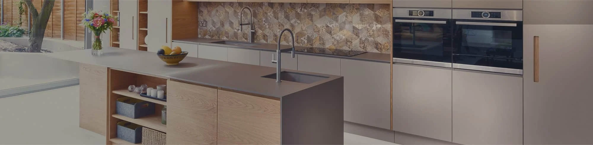
problem is that the cabinets, countertop and backsplash are all trying to become
the focal point at once.How do you match granite countertops with cabinet colours so the kitchen
doesn’t look busy? Identify the granite slab’s dominant background colour,
undertone and pattern strength, then choose cabinets that either blend with the
stone or provide controlled contrast. Keep only one surface — cabinets, countertop
or backsplash — as the dominant pattern, and repeat one accent colour across the
room.To match granite kitchen countertops with your cabinet colour,
start with the actual slab rather than a photo. Undertone and pattern strength
are easiest to judge in person, under your own kitchen’s lighting.
Can Granite Kitchen Countertops Look Too Busy?
Yes, granite can feel visually busy when its natural movement competes with heavily
grained cabinets, patterned backsplash tile or several contrasting colours. That does
not make the stone a poor choice. It means the other finishes need to support it.
A useful way to evaluate granite is to place its pattern into one of three broad
categories:
- Quiet: The slab has a relatively consistent background and small,
evenly distributed markings. - Moderate: The stone contains visible colour changes, mineral
deposits or movement without one highly dominant feature. - Dramatic: The slab has strong veins, large colour shifts or bold
areas that immediately attract the eye.
These categories are design descriptions, not technical grades. Granite is a natural
material, so its appearance varies between stone types and individual slabs. That
variation comes from how the stone actually formed: granite is an intrusive igneous
rock that crystallizes slowly from cooling magma below the earth’s surface, and its
mix of quartz, feldspar and mica minerals is what produces the background colour,
speckling and veining visible in a finished slab
(U.S. National Park Service, Geology of Igneous Rocks).
If you choose dramatic granite, let it become the main pattern. Simpler cabinet
doors, quieter backsplash tile and restrained flooring can give the stone room to
stand out without overwhelming the kitchen.
Start With the Actual Granite Slab, Not an Online Photo
A small photograph cannot show the complete scale or movement of a granite slab.
Screen settings, photography and showroom lighting can also change how its colours
appear.
Whenever possible, place a cabinet door sample beside the slab you are considering.
Look at a large area rather than choosing from one attractive corner. A pale section
might look perfect beside white cabinets while the rest of the slab contains much
darker or warmer movement.
If the granite has already been installed, bring cabinet, paint and backsplash
samples into the kitchen. Examine them during the day and again under the lighting
you use at night. A colour that looks neutral in daylight may appear warmer, cooler
or darker under artificial light.
Use Colour Balance and Pattern Control
Identify the granite’s dominant background
Step back from the slab and ask which colour you notice first. Is the background
white, cream, beige, grey, brown or black? This dominant colour gives you a starting
point for the rest of the kitchen.
Check the undertone
Two surfaces can both be described as white and still look wrong together. One may
lean creamy or yellow while the other has a blue-grey cast. Compare the surfaces
directly instead of relying only on their colour names.
Warm granite often contains cream, gold, brown, rust or warm beige. Cooler slabs may
show crisp white, charcoal, silver, blue-grey or black. Some stones contain a
mixture, which gives you more flexibility but still requires an in-person comparison.
Choose the dominant surface
Decide what you want people to notice first. If the granite has bold movement, use
calmer cabinet fronts and backsplash materials. If the granite is quiet, the cabinets
or backsplash can carry more colour and texture.
Repeat accent colours carefully
You do not need to match every colour in the slab. Select one background or accent
colour and repeat it through the cabinets, backsplash, hardware or wall paint. Too
many repeated colours can make the room feel overly coordinated rather than natural.
How to Match Granite With Popular Cabinet Colours
Every pairing below assumes you are comparing cabinet samples against an actual
granite
countertop slab rather than a photo — undertone comparisons only hold up in
person.
White cabinets
White cabinets provide a flexible background for granite, but the shade of white
matters. A cool, bright white may clash with a granite slab that has a cream or
golden background. Warm white or off-white often sits more comfortably beside those
tones.
For contrast, consider darker grey, brown or black granite. For a softer palette,
use a light slab with restrained grey, beige or taupe movement. If the granite has a
dramatic pattern, keep the backsplash simple so the white cabinetry can provide
visual breathing room.
Off-white and cream cabinets
Off-white cabinets generally work best with granite containing cream, beige, warm
grey, brown or muted gold. Compare the cabinet door with the stone’s lightest
background area. If one surface looks distinctly yellow and the other looks pink or
blue, they may not sit comfortably together.
Avoid choosing a backsplash that introduces a third version of white. A simple tile
related to either the cabinet colour or the granite background is usually easier to
coordinate.
Light wood cabinets
Light woods can pair with both light and dark granite. Pale granite creates a
relaxed, low-contrast palette, while charcoal or black granite adds definition.
Pay attention to the wood’s undertone and grain. A warm maple or oak finish may work
well with granite containing cream, brown or warm grey. A cooler or more neutral wood
finish may sit more naturally beside white, charcoal or blue-grey stone.
Because wood already has visible grain, use caution with highly active granite. One
pattern should be noticeably quieter than the other.
Dark wood cabinets
Dark wood cabinets have considerable visual weight. Lighter granite can create
separation, brighten the working surface and make each material easier to see.
Cream, beige, light grey or softly patterned white granite may provide that
contrast.
Dark granite can also work with dark wood, particularly in a larger or well-lit
kitchen, but the result will be moodier and more tonal. Review the flooring, wall
colour and lighting before committing to a dark-on-dark combination.
Grey cabinets
Grey cabinets need close undertone comparison because grey may lean blue, green,
violet, brown or beige. Do not assume every grey granite will coordinate with every
grey cabinet.
A light granite with charcoal or grey movement can create a connected palette.
Darker stone can add contrast to pale grey cabinets. If both surfaces contain
substantial movement or colour variation, simplify the backsplash and flooring.
Navy cabinets
Navy cabinets can anchor a kitchen, especially on an island or lower cabinets. White
or light grey granite often provides clear contrast, while stone with small dark
details can help connect the countertop to the cabinetry.
Some navy finishes lean green and others lean violet. Place the cabinet sample
against the entire slab before assuming that a blue or grey mineral deposit will be
a match.
Black cabinets
Light granite is the most straightforward partner for black cabinets because it
prevents the work surfaces and cabinet faces from merging into one dark area. A
white, cream or pale grey background can produce a strong but controlled contrast.
Black granite with black cabinets can create a deliberate monochromatic kitchen, but
it needs sufficient lighting and variation in surrounding finishes. Consider lighter
walls, flooring or backsplash materials to keep the room from feeling visually heavy.
Explore CGD’s
kitchen cabinet options
when comparing door styles and finishes for a GTA renovation.
How to Coordinate the Backsplash With Granite and Cabinets
A restrained backsplash is generally the safest companion for strongly patterned
granite. Choose a simple tile that repeats one quiet colour from the slab without
introducing another competing motif.
“Simple” does not have to mean plain white. A backsplash can have a subtle handmade
texture, gentle tonal variation or an understated shape. The goal is to keep its
visual movement below that of the granite.
Patterned tile can still work when the granite is relatively quiet. Before making
the decision, compare full samples at the distance from which you normally view the
kitchen. Tiny samples may hide how often a tile pattern repeats across an entire
wall.
Grout also affects the result. High-contrast grout makes each tile more visible and
adds another pattern to the room. A grout colour closer to the tile usually creates a
calmer surface.
Light Versus Dark Granite in a GTA Kitchen
Dark granite does not automatically make a small kitchen feel cramped, and pale
granite does not automatically make it feel spacious. The effect depends on the
complete combination: cabinet colour, wall colour, flooring, natural light,
artificial light and the amount of contrast.
A compact kitchen with dark cabinets and dark granite may feel visually heavy if it
receives little daylight. The same countertop can look deliberate in a kitchen with
strong lighting, reflective surfaces and lighter surrounding finishes.
GTA homes vary widely, from condominium kitchens with limited exterior light to open
suburban kitchens with large windows. Assess the materials in the actual room
whenever possible instead of applying a universal light-or-dark rule.
Complete a Five-Sample Check Before You Commit
Place these five elements together before finalizing the palette:
- The actual granite slab or the largest available sample
- A complete cabinet door in the intended finish
- Several backsplash tiles with the proposed grout colour
- A flooring sample or clear view of the existing floor
- The wall colour, hardware or another fixed finish
View the group from several feet away. Then check it close up. Look at it during the
day and under evening lighting. If one element suddenly appears too yellow, too blue
or disproportionately patterned, change that element before placing an order.
Photographs can help you review the overall palette, but they should not replace an
in-person comparison because cameras may alter colour.
Common Granite-and-Cabinet Matching Mistakes
- Choosing granite from a screen: Online images are useful for
inspiration, but they do not reliably represent the slab’s full scale or exact
colour. - Reviewing each finish separately: Attractive materials can still
conflict when placed together. - Using several dominant patterns: Bold granite, strong wood grain
and patterned tile may all compete for attention. - Ignoring undertones: Similar colour names do not guarantee that
two finishes coordinate. - Selecting the backsplash too early: It is often easier to finalize
it after the cabinet and granite direction is clear. - Assuming every slab looks the same: Natural stone varies, so
examine the slab intended for the project whenever possible.
Get Help Coordinating Your GTA Kitchen Materials
Cabinet, countertop and backsplash samples are easier to evaluate when they are
placed together. Cabinets & Granite Direct serves GTA homeowners through
locations in Markham, Mississauga and Vaughan.
If you are planning a
kitchen renovation,
request a consultation or quote to compare your cabinet and countertop direction
before making the final selection.
Frequently Asked Questions
What cabinet colour goes best with granite countertops?
The best cabinet colour depends on the granite slab’s dominant background, undertone and pattern
strength. Compare the actual materials and choose either a controlled contrast or closely
related tones rather than relying only on colour names.
How do you make busy granite countertops look less busy?
Make strongly patterned granite the main visual feature and keep the cabinets, backsplash and
flooring quieter. Simple cabinet fronts, low-contrast grout and a restrained backsplash can
reduce competition around the stone.
Should granite countertops be lighter or darker than the cabinets?
Granite does not have to be lighter or darker than the cabinets. Light-dark contrast makes each
surface more distinct, while similar tones create a moodier or softer palette. Lighting, room
size and surrounding finishes should guide the decision.
What backsplash works with patterned granite?
A simple backsplash that repeats one quiet colour from the granite is usually the safest option.
Avoid introducing another strong pattern unless the granite has relatively little movement and
the full combination has been compared in person.
Do grey cabinets work with granite kitchen countertops?
Yes, grey cabinets can work with granite kitchen countertops when their undertones coordinate.
Compare the materials directly because some greys lean blue or green while others lean violet,
brown or beige.
Should you choose the granite or cabinet colour first?
If you have selected a distinctive granite slab, use it as the starting point because its natural
pattern cannot be customized. If the cabinetry is already fixed, choose granite that works with
its colour, undertone, grain and the room’s other permanent finishes.